Reflections on the class "Web-Based Multimedia" and "Intro to Teaching with Digital Tools"

Archive for July, 2012

Mini Art School #4

I had fun making this video. I recorded all of the video with the help of my wonderful husband and my showoff of a dog. I put it together with AVS4You video editor. I was trying out some new transitions and the video in a video. It is still a bit difficult to see the difference in the skin color on his ear, but it is there. 

For the second part is my MMP project story board. I don’t have the best drawing skills, but hopefully you can see what the site will be like. I have the intro page, an example evidence page, an example lab page, and the help! page.  The help page I realized I may need when I was making the story board and making the actual wiki. Some students might have a hard time knowing how to use everything.

ImageLet me know what your thoughts are. I always love feedback, good or bad. 


Mini Art Project #3

I found for this project the reference pages in the design basics index were particularly useful.

First I’ll post my cropped images.

The first is interesting because the image I cropped to is hardly noticeable in the original photo.  In the design basics index it told us to keep an eye out for interesting elements in an image that can change the original feeling of a photo.

I used the same idea here. Although I’m lucky that I was able to get these pictures from my fathers good camera because there is a real danger of the images becoming pixelated.

I like how the rock looked in this picture and the different directions of the waves, but it was lost in the original picture. The original idea was to get a but of the sunrise colors, but they were not bright enough yet.
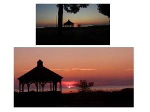
This picture was of the sunrise, but it was too far away. By cropping it closer there is a more interesting composition and the bright colors are a larger proportion of the image.

This was my favorite picture. It originally looked ruined because of a big glare in the middle, but I was able to crop that out an focus on my niece. It is over exposed, but it works for this picture because it give it a feeling like a dream.

This last one is an example of just a minor crop.  There was too much dead space on the right so it was cut away to focus the story of this image on the horses going to the Grand Hotel on Macinac Island, Mi.

The next mini art project I did was the color echo exercise.  I used a picture of my dog who I adopted 4 years ago.  I decided to make a flyer to encourage adoption.  A pet peeve of mine is that almost every pet adoption advertisement I see shows sad animals.  There are animals at the shelter that despite their predicament are incredibly happy.  In fact they are very happy all the time.  My dog was one of those dogs. So I used a picture of him to show that you can get a ridiculously happy and fun dog from a shelter too.  I use the color sampling tool to pick colors for the text and background.  It was challenging because there were not too many colors to choose from.  These are the 3 versions I came up with.

My Favorite is the last one. I don’t think the brown worked very well. The blue is from his tag, the cream is from his fur on his neck, and the brown is form the fur at the base of his ear.

The last project I did was the logo variation exercise.  I didn’t spend too long on making the logo so it isn’t perfect.  It is supposed to be a logo for dog agility (I have my dog on my mind) but the tire jump looks more like a lifeguard float.  This was probably the most basic of the 3 exercises I did.  I think I learned more making the logo than changing the colors. Although, it was very interesting learning about the different ways to print materials and the thought that goes into what colors can be used.  It was also nice to finally learn what hue, saturation, and value are.  I think the diagram on page 209 does a very good job at explaining it.  These are my logo variation. There are only 3 because the 3 color is the same as my full color.

Mini Art Project #2

I Had lots of fun with this weeks art project.  The two activities I choose was the “Word Portraits” exercise and the “Shape workshop,” specifically the color exercise.

The word portrait was very interesting.  The first two words of each font are supposed to be enhanced by the font because the font voice matches the style.  The third word is not supposed to fit the style to indicate how the fonts have a voice and if they have the wrong tone it looks off.  I thought it was very interested in the overly stylized fonts it is actually harder to read the word that doesn’t fit.  For example, it is easy to read “wedding” and “Reception” because you expect those types of words. It takes a moment to read “goofball” because it doesn’t fit.

This activity was more challenging than I thought it would be.  I usually have trouble picking out a font for my designs so I choose this activity in hopes that I would get a new sense of fonts. I think reading about the different fonts helped and thinking of them as personalities also helped.  To do this activity I imagined each font as a person and tried to think of what they would say and wouldn’t say.  For example, I imagined someone who was overly interested in espresso would not set foot in a dunkin’ donuts.

The second project I did was also very fun and another area that I generally struggle with in design, color.  When I wanted to paint my apartment I had to have my step dad pick out a color because none of the colors I picked looked right.

This was very fun.  I decided that I would use the same shapes but give them different colors in order to give them a different feel.  My favorite are the triangles and the chevrons. I like the triangles because the different colors give a completely different image. The top look more like mountains while the bottom looks more like a forest, but the shapes are the same. In terms of color choice I like the chevrons. I always had difficulty figuring our what colors go together.  What I tried to do for the colors is to pick something in nature that is colorful and use those colors.  I choose birds.  Each cluster of 2 chevrons are different birds. The top box is a goldfinch, cardinal, red winged black bird, and a yellow warbler.  The bottom group is a eastern bluebird, red tailed hawk, american kestrel, and a blue jay.

I’d love to heard what everyone thinks!

Mini Art School #1

Every once in a while I will see an ad or a website that has such a bad design that I can’t help but laugh. Recently I saw a mailer similar to the one below.  If you could believe it it was even more crowed than this was is, unfortunately I couldn’t find it so I will analyse this version in light of the design rules.  This is a ad for a party store called “Party Fair.”  Where to begin…

  1. It is over crowded. Every corner is full of stuff.  I don’t even understand why they have a hulu girl and two kids on a beach. (Layout sin #7)
  2. Zero margin. It should have a margin so text and images are not going right to the edge (Layout sin #5).
  3. The headline, the name of the store, is partially hidden because the background is the same color (Step 5 in works every time layout).
  4. Everything is centered, from the title, to the boxes (layout sin #6).
  5. The background is do busy and bright that they need to put everything in ugly boxes in order for you to read the text (layout sin #9).
  6. The main box in the middle is very bulky. I know they are trying to emphasis it, but if there was less going on then maybe they wouldn’t need a tacky exploding bubble.  I guess it is a party store, I think cheese is what they do (layout sin #4).
  7. Their primary competitor is Party City which has the same “every letter is a different bold color” logo.  They should consider a new, unique, image instead of copying their large competitor (chapter 2 research).
  8. The visuals are stacked down the left side of the page and have little to do with what they are advertising. It does a poor job to capture the essence of what they should be portraying, fun parties (Step 3 visuals).
  9. I supposed I’ll say two things that are kind of ok.  They didn’t warp their photos (design sin #9)
  10. They don’t seem to have trapped negative space. Infact there is bairly any negative space at all. (design sin #8)

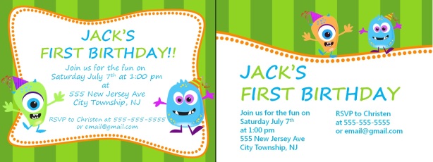
My next project I did for this mini art project is redesign an invitation that I designed for my son’s birthday party. Since this is online I changed all the information like the address, phone number, and email. The party is tomorrow though!


The original is on the left and the new one is on the right. I changed the text so it is left justified instead of centered.  I changed the layout to follow the “Works Every Time” layout. I think it improves it so it has a cleaner, more professional look, but still fun.  It is a baby’s birthday after all.  I also changed the body font to be more readable and increased the size of the tile.  The green guy blended in so I tried to make him more orange. I couldn’t quite get the color right though.

Finally I did the “Design Basic Index: Decisive Presentation Exercise”

This was a lot of fun. I like doodling, but this forced me to try some new things.  I discovered that I really like big objects in small frames and I like the combination of strait lines and curves. I also discovered that circles are very hard to draw freehand. I supposed I could have done this on the computer, but I felt like drawing for a bit. I use to draw a lot and I miss it.

I hope you enjoyed reading this blog. Now I’m going to see what everyone else has done.

Tag Cloud